Drill down to the Root Cause in a Pareto bar
You can easily drill down into the data behind a Pareto Chart bar to uncover the root cause of that defect.
To drill down into the data behind a Pareto bar:
-or-
The Drill Down Pareto Chart Selection dialog box opens. See Using the Drill Down Pareto Chart Selection dialog
 Tip: If you want to determine the most likely items on a Pareto chart in which to drill for further analysis, select Start Drill-Down Wizard from the GainSeeker Charts window Options menu or right-click a Pareto chart and select it from the right-click menu that displays.
Using the Drill Down Pareto Chart Selection dialog
The Drill Down Pareto chart Selection dialog offers options for drilling down through successive levels of data.
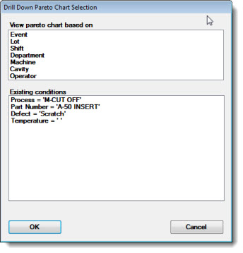
Fig. 1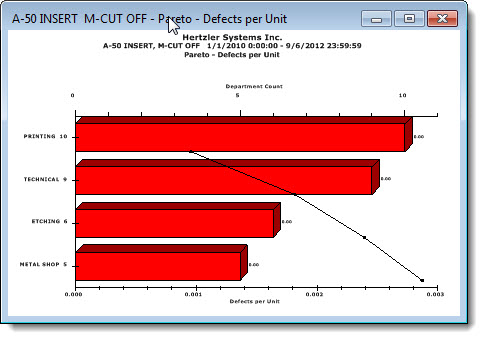
The bar into which you are drilling on the original Pareto Chart displays the color red (Fig. 2 below) in this example, as does the new bar chart Fig. 1). This indicates that you are currently drilled into the second level of data. As you continue to drill down, the bars will display a succession of specific colors to indicate which level you are at:
Fig. 2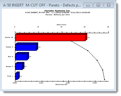
You can drill further into the data by clicking a bar on the chart. You can also return to the original chart (Fig. 2) to drill down into the data for another bar.
Fig. 3: The third drill down is by Shift in this example, which is represented by the green-bar chart at bottom left for this example. The chart with data one level above now displays a green bar to indicate it as the bar that is being drilled down. You can continue to drill down on any of the bars on any of the charts.
Fig. 3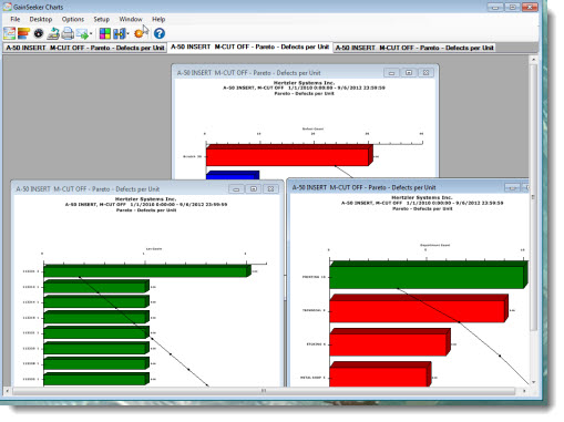
About Pareto bar drill-down colors
To help distinguish drill down levels, GainSeeker assigns a succession of colors. The colors of the Pareto bars can help you remember on which bar you were drilling down and the order of the drill down. Once you drill down on a bar, it changes to the color of the next level of data that follows it.
The colors are assigned to the standards in a revolving cycle in the order shown in the table below. For example, if your system has been set to use Medium Slate Blue as the color for the first standard, then Yellow, Dark Turquoise, Dark Red, and Lime would be used to denote the second, third, and fourth standards, respectively.
For example, in the sequence in Fig. 3 above, the original bar was Blue on the first chart (center). The first drill down was done on the top bar of that chart, which changed to Red. The third level of data is Green and the top bar of the second drill-down bar turned to Green from Red. If you were to drill down on a bar in the chart that currently features all Green bars, it would turn that bar—and the new chart made from it—the fourth level color: Orange.
Colors that identify drill-down levels
The colors are assigned to the standards in a revolving cycle in the order shown in the following table. For example, if your system has been set to use Medium Slate Blue as the color for the first standard, then Yellow, Dark Turquoise, Dark Red, and Lime would be used to denote the second, third, and fourth standards, respectively.
|
Level
|
Color
|
Example
|
|
1
|
Blue
|
|
|
2
|
Red
|
|
|
3
|
Green
|
|
|
4
|
Orange
|
|
|
5
|
Dark Magenta
|
|
|
6
|
Gold
|
|
|
7
|
Navy
|
|
|
8
|
Orange-Red
|
|
|
9
|
Dark Green
|
|
|
10
|
Tomato
|
|
|
11
|
Medium Slate Blue
|
|
|
12
|
Yellow
|
|
|
13
|
Dark Turquoise
|
|
|
14
|
Dark Red
|
|
|
15
|
Lime
|
|
|
16
|
Chocolate
|
|
|
17
|
Fuchsia
|
|
|
18
|
Olive
|
|
View all charts without overlap
Side-by-side comparisons of charts can be useful in analyzing drill-down levels. You can tile the charts so they will not overlap on the GainSeeker Charts window:
–or–