If
you have set options for
OEE retrievals for a configuration, the caption for the DMS
Charts dialog OEE/DMS Charts
dialog.
If
you have set options for
OEE retrievals for a configuration, the caption for the DMS
Charts dialog OEE/DMS Charts
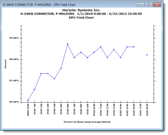
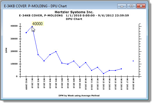
dialog.A DPU (Defects Per Unit) chart groups data by a selected time period and plots these groups as single data points representing successive time intervals. You can choose to group data by one of many available time increments including Day/Shift, which groups data separately for each shift in a 24-hour day.
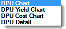
The Charts tab of the DMS Charts dialog has four options for DPU chart types
If
you have set options for
OEE retrievals for a configuration, the caption for the DMS
Charts dialog OEE/DMS Charts
dialog.
|
Contents [Hide] |
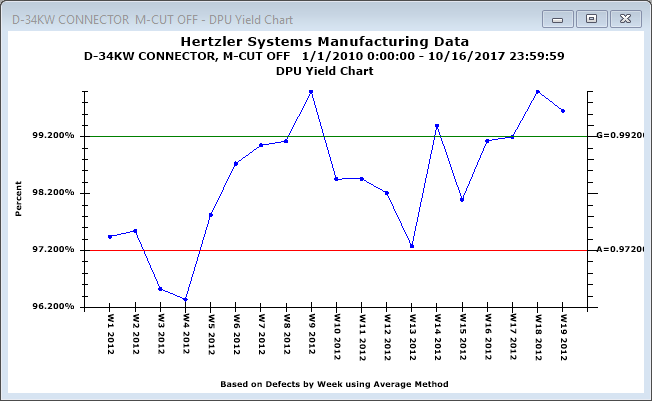
An example of a DPU Yield Chart follows in which grouped data is plotted by weeks.
DPU Charts |
What information it contains |
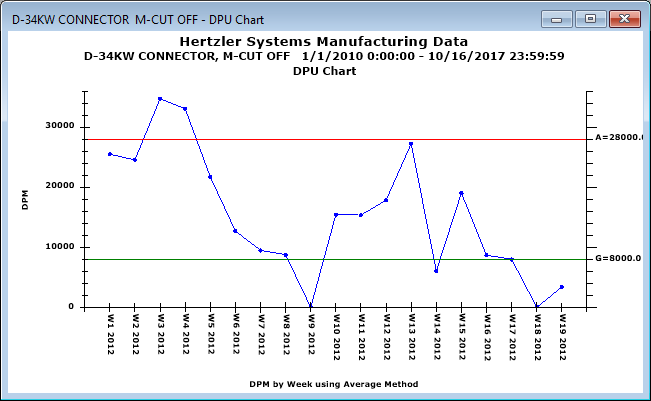
DPU Chart |
Displays defect levels of processes over a selected time interval using a chart format. |
Yield Chart |
Displays yield levels of your processes over time and shows how the percentage of good units changes over time. |
Cost Chart |
Displays the cost of defects or defective units over time. Costs are calculated based on cost per standard, cost per defect, or cost per sample (in traceability). |
Detail Table |
Displays data and traceability information for any given point by a selected time interval using a table format.
|
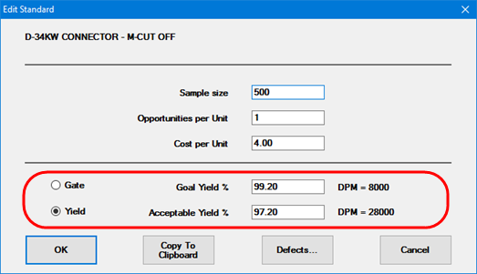
On a DPU Chart or a DPU Yield chart for a DMS standard that has a Goal Yield and/or Acceptable Yield set, you can display either or both of those values on the chart.
You can also set the colors and abbreviations for these lines.