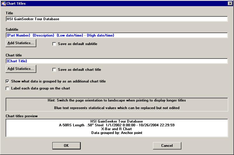
If you want to change the title, subtitle, or chart title on your chart, select Options, Chart Titles from the menu bar or move your cursor onto the chart, right-click your mouse button, and highlight Chart Titles. This customizing option is not available for Reports, Statistic Lists, or MINITAB chart windows. For charts containing data from multiple standards (such as Multiple Charts or a Group Chart), the Add Statistics button is not available.
Click in the text boxes and type in the new chart titles.
|
|
If you change the title, the new title applies only to the current chart. For information on setting the default title, see Print title/Company name.
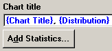
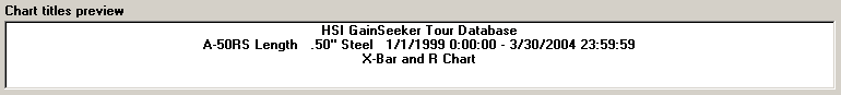
The default subtitle contains the smart label. A smart label includes the part number, its description, and the date/time stamp. You will not get a smart label on statistics lists, data tables, or any of the charts displaying multiple part numbers. If you want to change the default subtitle, click on the Add Statistics button. You will see the following dialog:
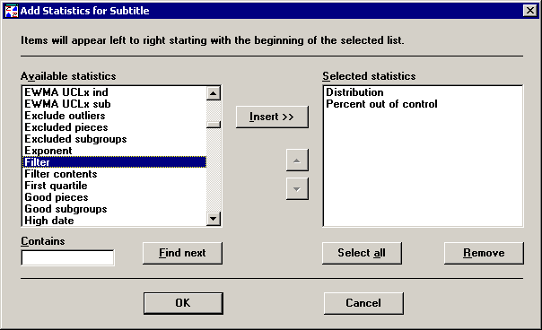
Highlight each option you want to include as part of the default subtitle and click on the Insert button. Doing so enters your options into the Selected statistics box. If you need to change your selected options, you can highlight one and delete it or click on Select all to highlight and delete all of them. To search for items from the Available statistics box, either scroll through the options using the arrows or type one or more letters or numbers in the Contains box and click on Find next. Continue clicking on Find next to search for all the options with the letters and/or numbers you entered in Contains.
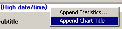
In addition, you can add the default chart title - such as "X-bar and R Chart", "Histogram", etc. - to the subtitle. To do this, right-click in the Subtitle box and choose Append Chart Title.
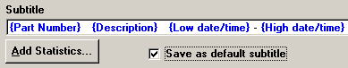
To specify a new subtitle default, make your desired changes and select the Save as default subtitle check box on the Chart Titles dialog pictured below.
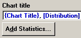
By default, when you click Add Statistics to append new statistics to the Subtitle or Chart title, the new statistic is listed between square brackets [ ] and the statistic label is displayed.
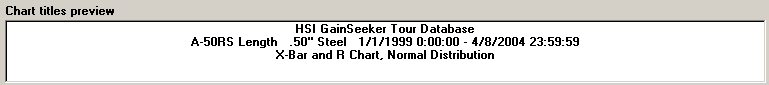
For example, if you add the Distribution statistic to the Chart title, it is surrounded by brackets as shown below:
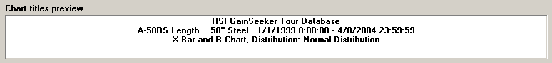
and the Chart titles preview displays the label "Distribution:" on the bottom row.
You can remove the "Distribution:" label by following these steps:
Double-click the statistic [Distribution] in the Chart title box.
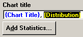
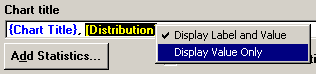
Right-click this highlighted statistic ("[Distribution]") and then click Display value only.
This replaces the brackets [ ] with braces { }
and removes the "Distribution:" label from the Chart titles preview.
To add the label again, repeat these steps but select Display Label and Value from the right-click menu.
|
|
To automatically add statistics without their associated labels, press CTRL while clicking Add Statistics. You can look for the braces surrounding these statistics and the sample text displayed in the Chart titles preview to confirm that you have performed this function correctly.
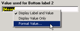
Single-click the statistic to select it.
![]()
Right-click the selected statistic and then click Format Value.
On the Format String screen, enter the format for this statistic. For valid format options, see Numeric formats, String formats and Date/Time formats.
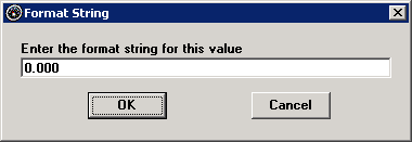
The format string is then displayed with the statistic.
![]()
If your chart displays data that is grouped by anchor point, traceability field, or another value, two additional check boxes are available on this screen. If your chart does not contain grouped data, these check boxes are not displayed.
![]()
To add a line to the chart title area that indicates how data is grouped, select the Show what data is grouped by check box.
To display a label above the X-bar chart for each new data group, select the Label each data group check box.
The chart title is changed from the Chart Titles dialog, pictured above, in exactly the same manner the subtitle is changed. For an explanation of this process, see Changing the default subtitle or Changing the current subtitle, depending on your desired change.
As you make changes to your title, subtitle and/or chart title, those changes are reflected in the Chart titles preview field on the Chart Titles dialog. Check it to make sure your titles will appear correctly on your charts before proceeding. After reviewing your possible changes, click OK to proceed or Cancel to disregard and return to the main module without any changes being made.
For the current Process Capability chart window, you can change the labels used to distinguish one data distribution from another.
Right-click on the Process Capability chart, or click the Options menu. Then click Legend.
This displays the Process Capability Legend screen.
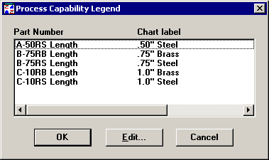
Click the Chart label that you want to change, and then click Edit.
This displays the Edit Chart Label screen.
Type the label you want to display for this data distribution, and then click OK.
Select Options, Lines from the Menu Bar. Click the X Axis Labels tab.
You can choose to label the X-axis (the horizontal axis of a chart), by Count (the default), Date, or Traceability field.
Labeling the X-axis by Count
By default, the X-axis is labeled by count, and the X Axis Labels tab looks like this:
Labeling the X-axis by Date
To label the X-axis by date, click Date. For Combined Control Charts, this option is only available if Date/Time is one of the fields used to match data records from different retrieval groups.
The screen will change to look like this:
If you have many data points, you probably will want to select Display values at scaled intervals to avoid an overload of labels on your chart. You can select whether you want to show the entire date (year, month, day, hour, minute) or only parts of the date. If your chart contains more than 12 data points, the program shifts the labels from a horizontal to a vertical position in order to allow enough space for them on the chart. Click OK after making your selection.
Labeling the X-axis by Traceability
To label the X-axis by traceability fields, click the Traceability list box. For Combined Control Charts, this option is only available if traceability fields are used to match data records from different retrieval groups. You can choose the part number or a traceability field.
The screen will change to look like this:
As with the date labels, you can choose to display every value or to display values at scaled intervals. You will need to select the field you want to analyze. For Combined Control Charts, only the fields used to match data records are available.
Since a traceability field may have up to 30 characters, you may want to shorten the value label in order to make the chart easier to read. If the traceability values are short, click Display entire value. If they are long, click Display a portion of entire value. Select the number of characters you want to display by clicking on the up or down arrow buttons. Then select if you want the first or last characters of the value displayed. For example, if you decide to display eight characters, you then can choose whether you want the first eight or the last eight characters from the traceability value displayed.
Changing the label interval
Based on the number of data points on the chart, SPC automatically determines the number of intervals at which to display labels on the chart's x-axis.
If you want to display more or fewer labels on the x-axis, you can change the value in the Increment box. The increment is the number of unlabeled data points between two labeled points.
To display more labels on the x-axis, enter a smaller number in the Increment box.
To display fewer labels on the x-axis, enter a larger number in the Increment box.
When you type a different value in the Increment box, SPC automatically updates the Number of steps – the number of labeled points.
The new scaling you set applies only to the current chart.