One of the most exciting aspects of the GainSeeker Suite SPC Software Release 8.2 are new dashboard controls embedded in GainSeeker Charts.
Like the earlier versions of Enterprise Dashboard, you can build Dashboards with dial gages and bar gages and tables showing real time failures, or all parts that are out of control, or with a Cpk of less than 1.33, or all processes with a defect level of over x%. It’s a pretty impressive list.
In prior releases you created a window for each of these controls. Now you can put as many of them as you want on a single window. This makes it much easier to see all these dashboard components at the same time.
But 8.2 doesn’t stop there. In addition to all of these controls, 8.2 adds new controls that give you unprecedented power to make data more visible and actionable. A great example of this is a button that you can use to launch other applications (like Data Entry), and a Timer control changes color under certain conditions. These capabilities create a whole new category of dashboards, the Control Center Dashboard.
A few months ago I did a series of blog posts about different types of dashboards. The ones I identified at the time were Scoreboards, Meeting Room Dashboards, Stakeholder, and Mobile Dashboards.
The Control Center Dashboard is a whole new type of dashboard, and brings deeper meaning to the word “actionable.” Let me give you a real life example.
Recently a customer approached us and said he wanted his operators on the shop floor to have three things in front of them at all times:
- A count of the real time failures (by cavity).
- A control chart for a key measurement (grouped by cavity),
- Some kind of indicator (preferably in color) that told the operator when it is time to collect data.
There are several ways we could have done this in earlier versions of GainSeeker, but all of them required special code (in a GainSeeker Data Entry Template) to make them work. This special coding wasn’t always cost effective.
Version 8.2 makes it possible to achieve all of these goals with a Control Center Dashboard. And that it can be developed by anyone with a little knowledge of the dashboard controls, so it is much more cost effective to deploy.
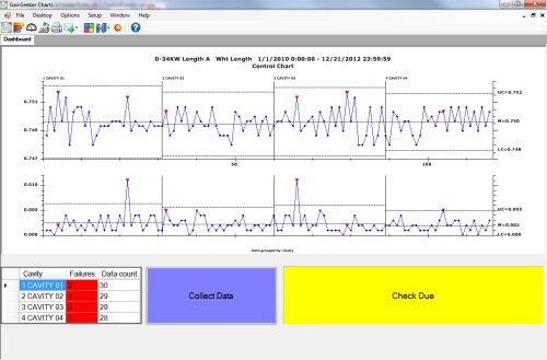
Here is what it might look like:
Across the top of the dashboard is a control chart of our critical feature, grouped by cavity. You can see at a glance how the cavities vary over time. Of course this could be different operators, or shifts, or other subprocess. Or it could be any other type of GainSeeker Chart.
On the lower left side is a count of the real-time failures for each cavity. This matches the chart, but puts the information into a color-coded table. The user can right-click on any of the red failure cells and quickly drill in to see the actual data, notes, or other relevant information.
In the bottom center and left, however, are two controls that make the Control Center Dashboard such a powerful tool.
The yellow box is a date control that links to the last data record collected for this feature. This box is green (or whatever color you want) when no data collection is needed. When data collection is coming up soon, you can set the box to another color (in our case we turn it yellow when a check is due in 10 minutes. Then when the check is past due, we set it to red, and change the text to read: “Enter Data Now”.
In the middle is a blue button that the user can click to launch data entry.
From this Control Center Dashboard, the operator can get to everything he or she needs.
There are a lot of other things you can do with these and the other controls. Stay tuned – over the next few days well look at some other cool new features in the new GainSeeker Charts module. You can also use the ShareThis button below to mark this page, leave a comment, schedule a conversation, or call 800-958-2709.

