Last week a colleague sent me a link to a new white paper that you should take a look at. It is published by SAP and titled “Reaping the benefits of next generation dashboards.” You can download your own copy from The Dashboard Spy.
The white paper describes the problems it sees with current dashboard and business intelligence solutions (they are inflexible and too cumbersome to use). And it offers a punch list of features for what it describes as the “Next Generation Dashboard.” Here is the list:
Next Generation Dashboards must:
- Be easy to build and customize
- Provide a consolidated view from any data source
- Leverage visualization to make information easy to consume
- Offer engaging interactivity for further analysis
- Provide the information in a personalized and easy to understand format
- Allow developers to extend new features or integrate to new technology
The white paper concludes with a list of the benefits users can expect to see from these next generation dashboards.
As I read the report I wondered how this vision of the Next Generation Dashboard matched our vision of the data driven organization as defined by the Data Cost / Value Matrix. 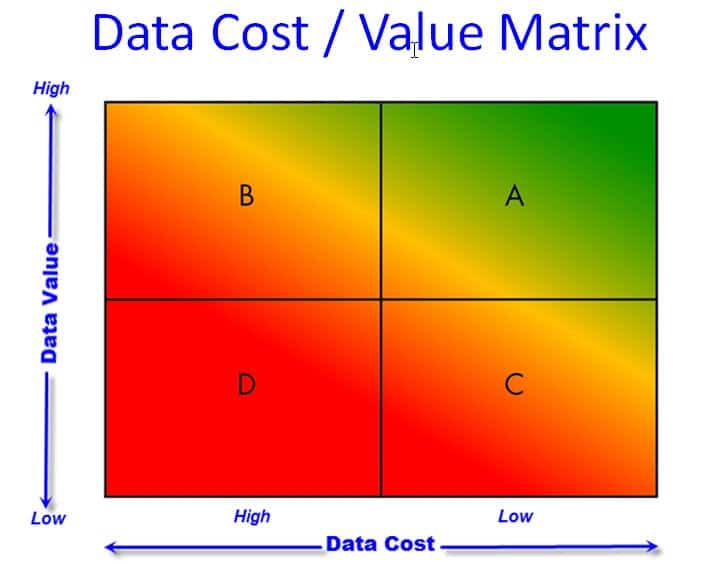
The Data Cost / Value Matrix identifies four aspects of Data Cost and four aspects of Data Value. You can learn about this and where your company is in this respect on the background page.
Let’s take the four aspects of Data Costs and see how the white paper approaches them:
Complete: We collect all the data we need, and no more than is necessary.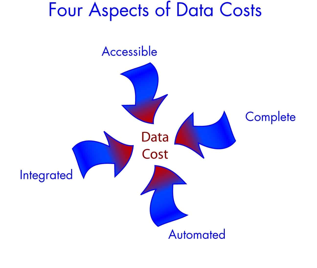
The white paper seems to begin with the assumption that we have all the data that we need, and that all data are good, reliable, and necessary.
My experience is that most organizations are smothered in data. Typically it is the wrong data. All too often organizations focus their attention on the data they CAN get, and do not spend enough energy on the data they SHOULD get.
When we make the wrong data more actionable we have gained nothing.
I think the Six Sigma Master Black Belt described in this case study from a financial services firm was right on track when she engaged in manual data collection first because she “was able to gain valuable insight into the nuances of the various operational definitions used by the process owners, and in the way the information system supported or did not support those definitions.”
This white paper overlooks this issue.
Automated: We write down very little data. In fact, we type very little data into computer systems. We use bar codes, RFID or other identification technologies. We capture data from digital equipment whenever possible. Wherever possible we have eliminated human interaction with data collection, and we are confident through data driven statistically valid measurement system analysis that the data are reliable.
The white paper is very strong on the first part of this because of its emphasis on the integration and interconnectivity of data systems. At the same time, it seems unaware of Measurement Systems Analysis and the contribution it should make to this process. It may be the MSA is too technical and therefore beyond the scope of this kind of white paper. However, the world envisioned by the white paper – where everything is fully automated – overlooks the premise that we need to be thoughtful about our data.
One of my favorite business quotes is by Peter Drucker: “Nothing is worse than making more efficient what should not be done at all.”
Integrated: We have specialized data systems to run various aspects of our business, but we don’t have silos of data that are used for only one purpose when the data can be useful to other applications. Put another way, data is never entered more than one time anywhere in our business.
This is one area where the vision of the next generation dashboard is in close alignment with the Cost / Value Matrix.
Accessible: Anyone can get to the data they need at any time. We don’t have to rely on specialists to write special queries or export data. We’ve learned that our people do not need to be programmers to make good use of data.
Clearly the white paper is aligned with this aspect of reducing the cost of data. This comes up several times in the article, as in this quote: “the next generation of dashboards empower non-IT professionals to design and connect business data to a dashboard interface.”
So the white paper endorses integration, accessibility, and automation. It seems to fall short on the issues of completeness and data reliability.
Lets turn out attention to the four aspects of Data Value.
Product Release & Control: We use data to validate that our products are acceptable for shipment. This data is primarily accept/reject type data, and may be based on either measurements or some other kind of pass/fail criteria. The pass/fail criteria is based on the voice of the customer.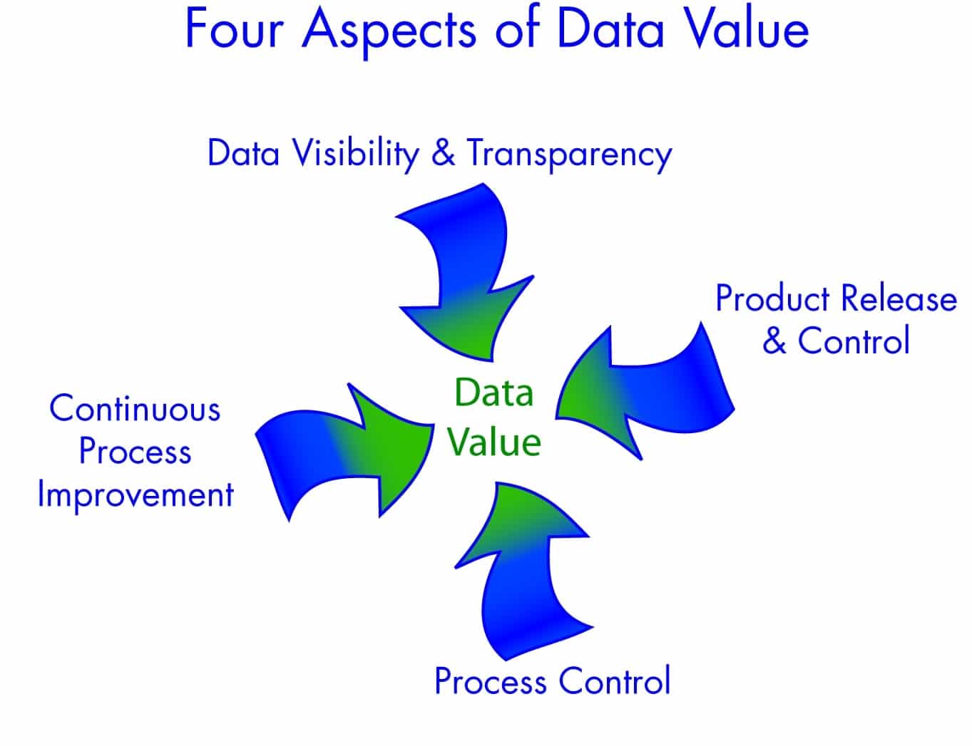
The white paper jumps on this with both feet. Under the heading “Leverage visualization to make information easy to consume” it suggests a product release and control strategy as one of the fundamental ways users should consume information: “In addition to robust data visualization, next generation dashboards provide methods to visually alert a user when performance indicators are out of tolerance, then enable the exploration of details with point and click simplicity.”
This is a great example of a Product Release & Control approach to the world: Test a result against the tolerance ( tolerance = specifications = Voice of Customer) and alert the user when something fails. Clearly this is a huge advantage to companies to get this kind of information – especially if it is provided in real time so that prompt corrective action can be implemented.
Process Control: We apply statistical process control tests to key products and processes. These activities use the Voice of the Process to determine the stability of our process. We react immediately to instability and unexpected variation.
On the issue of Process Control, the white paper falls completely silent. There is no indication that the authors understand this critical point of delivering value with data.
It may be that this is an oversight. More likely it is a point of value that is not appreciated by the authors. Making this a point of value assumes that the user understands the difference between Voice of Process and Voice of Customer. In my experience this distinction is not commonly understood. Even people who have been through Six Sigma training or who are certified quality engineers sometimes confuse the issue. We readily understand “outside the specs.” We’re far less likely to embrace or distinguish the more abstract “out of control.”
This is an important short-coming in this vision of the Next Generation Dashboard.
Continuous Process Improvement: We use data to close the loop on our processes and drive continuous improvement. All of our people are trained to use this data to look for hidden sources of variation and correlation between key input and key output variables.
According to the white paper, the fundamental benefit of implementing Next Generation Dashboards is to improve processes:
Notably, C-level executives use business intelligence to improve processes, ensure compliance, optimize marketing efforts, and increase sales. And department managers can use the information to improve their operations and monitor the performance of their groups.
In another section of the white paper, the authors note that Next Generation Dashboards should “enable the exploration of details with point and click simplicity.”
Clearly these are signs of commitment to continuous process improvement. I wonder, however, if the proliferation of dashboard tools will be matched with a similar effort to make sure people use the data in meaningful ways.
My mother spent her career teaching fourth grade. I’m old enough to remember the alarm bells she rang when pocket calculators were first introduced: “But will these kids actually understand the answers they’re coming up with? Or will they just get wrong answers faster and assume that they’re right because a computer spat it out at them?” The older I get, the more I see what she warned against. This situation is a grown up version of the same problem.
Data Visibility & Transparency: Our data is readily visible at all levels of the organization. Every stakeholder, from process owners to the leadership team, can put their fingers on the performance data that matters to them. Information is summarized in easy-to-understand dashboards that help them separate signal from noise so they don’t react to the wrong things. Furthermore, they can readily get to the underlying data to better understand the drivers of their key metrics.
This is actually a pretty good summary to the Next Generation Dashboard White Paper. Clearly the authors “get” this vision.
In summary, the white paper is in alignment on many aspects of the Data Cost / Value Matrix. There are a few points where it falls short. Most notably if falls short in its vision of the importance (or the real cost) of complete and accurate data, and the value it places on the Voice of Process.
The fundamental assumption of this white paper is that business processes can be characterized by data. If we set aside the (very important) questions about the reliability and repeatability of data for just a minute, the question that comes to the forefront is “what theory shall we apply to the data that characterizes this business process?” Or, in the words of Dr. Deming, “By what method?” shall we reach our goals?
If we fail to attend to the Voice of the Process, our efforts will certainly be suboptimized. GainSeeker Suite and GainSeeker’s Enterprise Dashboard implement all of the requirements outlined by the white paper for the Next Generation Dashboard and they make it very easy to pay attention to the voice of the process.
What do you think? How important is the Voice of the Process in your dashboard? What are you doing today to build dashboards for your business? Use the ShareThis button below to mark this page, leave a comment, tweet me, schedule a conversation, or call 800-958-2709.
2 Comments
Comments are closed.

Very good points. Many people don’t think about data this thoroughly. As the name of the blog is “The Data Heads” I guess I shouldn’t be surprised that you focus on the data process that precedes creation of dashboards.
I am curious what you think about the points that the paper raises with regard to the dashboards themselves. Specifically, what do you think about http://visualizefree.com and how closely it achieves these goals.
-Byron
Byron – Thanks for your comment. VisualizeFree looks like a great site – we could have some fun with these tools.
You asked about how well the site addresses the points raised in my post. At first glance, it looks like your product does really well with the aspect of data value that I call “Data Visualization and Transparency.”
But you’re right in your comment that we’re very interested in the data process that precedes dashboard creation. Lots of people have lots of data. But lots of that data is almost useless because of poor operational definitions, inadequate measurement systems analysis and an impossibly high noise to signal ratio. Paying attention to the underlying data collection process can help address those issues.