Update July 7, 2010: KPI Dashboard screen cap added below.
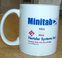
I’m finally getting around to reporting on the Monday’s joint Minitab / Hertzler User Group meeting. Jay Bronec of QualiFine took my cheesy idea for a name seriously and gave everyone MUG HUG mugs. They’re pretty cool.
We had great presentations from a bunch of people, but the show stealer was Jamie Dobravec’s. Maybe it is because he was talking about something near and dear to my heart – KPI Dashboards. But I don’t think it was just me.
Jamie has been using GainSeeker for years, beginning back in the DOS days. As a manufacturing engineering he became accustomed to relying on GainSeeker for up-to-the minute shop floor quality data.
All these years later he is now Operations Manager and he found himself longing for timely business metrics – things like month-to-date sales performance, gross profit margin, on time deliveries and first pass yield.
His ERP system had all this information, but he couldn’t get to it.
Well, thats not quite true. He could get to it, but it meant manually running nine different queries on his AS400, and then cutting and pasting data into Excel so he could turn it into a graph. The manual system was so time consuming that he just couldn’t do it and do his real job. And like everyone else, he is operating lean – so there is nobody he can throw the work at and say “I need this report every day at 7am.” So in reality, he couldn’t get to it.
He also considered traditional BI and ERP reporting solutions, and found they had lots of zeros in the price tag. Given the cash crunch of the recession, he couldn’t justify the expense.
Enter Jay Bronec of QualiFine.
Jay’s a smart and savvy guy, and he knows about as much as anybody on our technical staff. And Jamie was already using GainSeeker in his business operations, so he didn’t need to spend any capital. He didn’t need any extra software licenses.
Jamie sat down and sketched out what he wanted. He said it wasn’t on a napkin, but as close as you can get without lunch. And Jay went to work.
Now with a couple of clicks, Jamie gets an up-to-the-minute dashboard of his critical business performance metrics (KPIs). He can drill into the raw data and see trend charts or Pareto charts behind the dashboards. Its all there.
Grayhill KPI Dashboard
I wrote up a short account of the case study and published it on our website. Jay has one with more quotes from Jamie, and a little more detail on his web site.
What about you? Would a dashboard of your organization’s Key Performance Indicators help you make better, more timely business decisions? Use the ShareThis button below to mark this page, leave a comment, tweet me, schedule a conversation, or call 800-958-2709.

