I chose the topic of DPU (Defects Per Unit) Charts to talk about this month. Most people, when I talk with them concerning defects, are familiar with Pareto Charts. They pretty much go hand and hand. I get it, especially with GainSeeker’s Pareto Charts you can easily drill-down into them. Not as many people utilize the DPU Charts and I thought it was time to showcase this feature, especially since we added second level grouping in GainSeeker Version 8.8!
Types of DPU Charts available
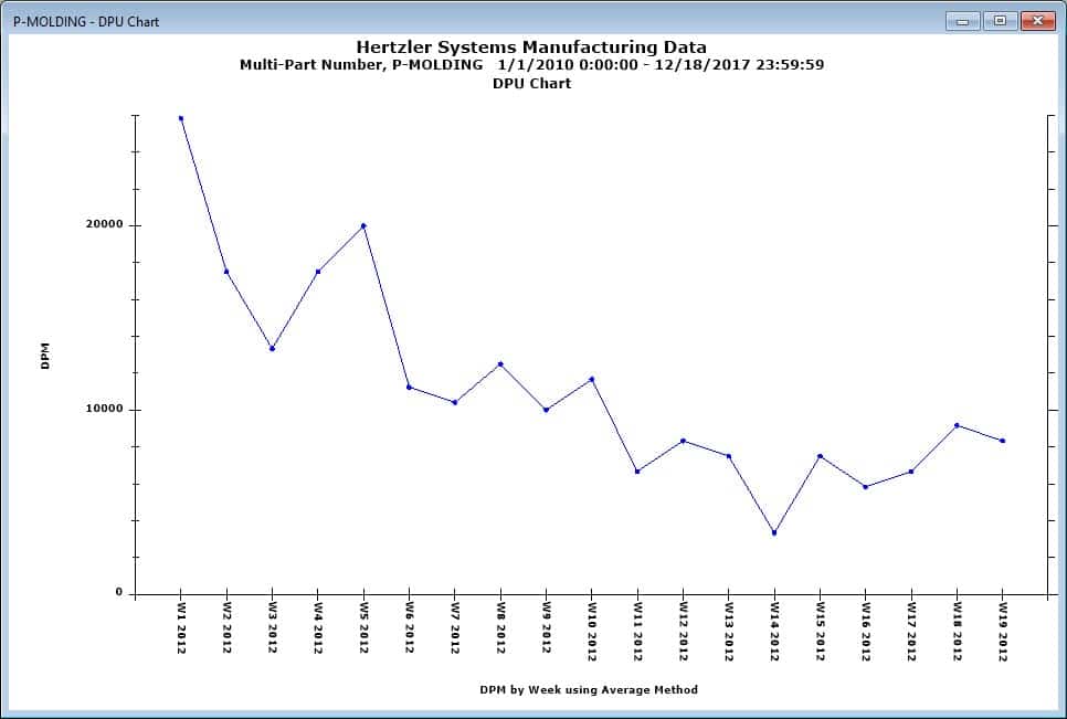
- A Standard DPU Chart: By default looks like this first image. Of course there are many options in your chart settings to be able to change it.
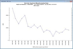
GainSeeker DPU Chart
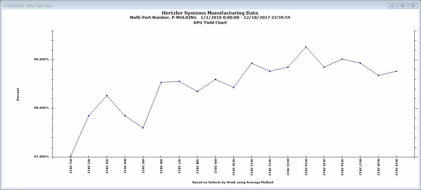
- A DPU Yield Chart: This chart changes the Y axis from DPM to a percent as you can see below.
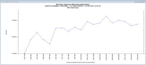
GainSeeker DPU Yield Chart
- A DPU Cost Chart: This chart displays the cost of defects or defective units over time. The costs can be setup to be calculated in a few different ways; on a cost per standard, cost per defect basis, cost per recorded stored. This depends on the way your company set up your defect costing.
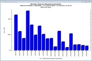
GainSeeker DPU Cost Chart
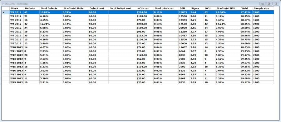
- DPU Detail: Choosing this chart shows you the details of each record stored for that time period.
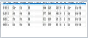
GainSeeker DPU Detail

Second-level grouping
Now that I gave you a quick introduction to the DPU Chart, I can show you where the second level grouping option comes in and how it looks. There are a few ways to get to the second level grouping.
- Start with any of the DPU Charts I mentioned above.
- Click on the settings tab.
- Expand the Retrieval/Configuration setting and then double-click (or right-click) on the Group data for DPU chart by setting.
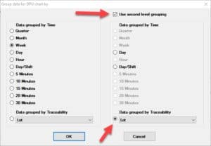
GainSeeker DPU Chart Settings
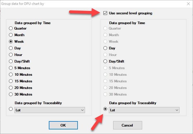
I added two red arrows to the image above to bring attention to the new grouping option.
- Click on the “Use second level grouping” to activate the options in the right-had column.
- Select to group the data by time period, or
- The second red arrow points to the drop down list where you can do a second level grouping by a traceability field.
If you already have a DPU chart up you may simply click on the new group/Sort icon ( ![]() ) to access the Group settings.
) to access the Group settings.
I made a short video below to demonstrate how easy it is to use this setting. The video shows both ways from above to include the second level grouping.
Thank you for your time.
The next GainSeeker TechTips LIVE is now on the calendar!! Save the date of January 18th, 2018 at 2pm EST. As a result of the awesome feedback we received we narrowed the topic and upgraded our sound equipment. The topic will be on Implementing OEE – Plan, Enter Data, Display. Below is a link that allows you to register for this event. Look for the “Register” link under the pictures. The password to register is GSTTL.
Click here to register!
If you do not have GainSeeker yet, I urge you to schedule a demo! Oh, and if you tell them Jen sent ya, I will sit in on the demo with you to help answer any technical questions you may have.
