Not long ago I had an interesting conversation with a customer, a corporate quality systems guy from a multi-plant corporation.
We had installed GainSeeker as a pilot project at one of his plants, and he and I met to plan deployment to another division. Unfortunately a couple weeks after we launched the pilot, corporate had completely upset the management apple cart at the plant and brought in (among others) a new quality manager. We met the QM and I’m sorry to say she had that deer-in-the-headlights look:bright and capable but completely overwhelmed.
In short, GainSeeker was installed but not being used except to collect a bunch of data. Not to put too fine a point on it, the QM’s training reminded me of the Dilbert cartoon where Dilbert says to the new hire: “This is your mouse. Move it around if you see anyone coming. And remember if you ask any questions you’re bothering me.”
My corporate contact bemoaned the lack of evidence to take back to his boss, which led us back into a conversation that we had touched on many times before: “Why are you deploying GainSeeker in the first place? Where is the money?”
As we talked it became clear that material costs were going through the roof, and the company needed to find ways to control and reduce those costs.
Eventually we went back to the QM’s office and her computer where we spent about 10 minutes digging into the data that they were already collecting.
What I found surprised all three of us. Here is a control chart of the data, our starting point. (Click on the chart to see it full-sized in a new window.)
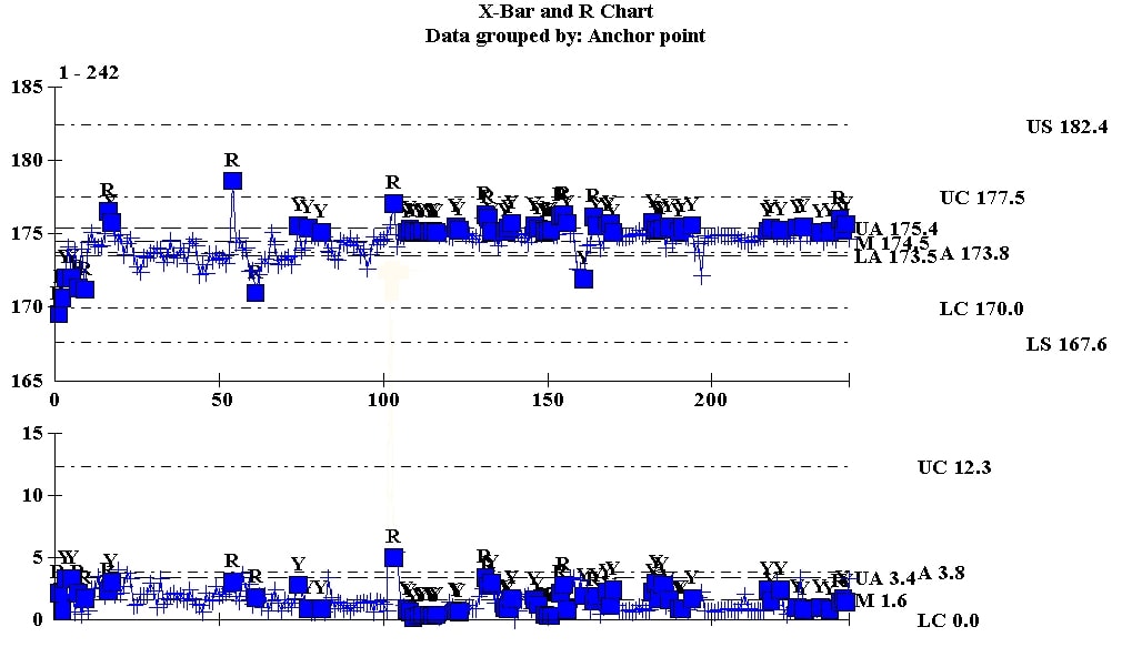 A quick glance at this chart shows some fundamental instabilities. (And I wouldn’t recommend putting specs on the chart, but that is another topic.) But looked at this way, the chart doesn’t help us get to the underlying issue – reducing material cost.
I wanted to see if GainSeeker’s Analysis Wizard could help us see inside the data to identify any underlying causes.
In a few seconds I had learned that Shift A had the highest variance among three shifts. Not only that, but the wizard automatically drilled into that shift and pinpointed clock number (operator) as the number one driver of variation on that shift. You can see that in the following chart.
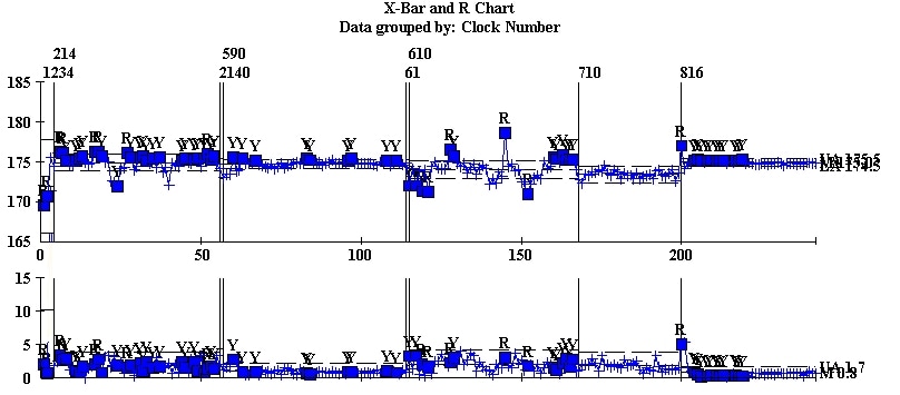
If you click on this chart it will open in a new tab or window, and you’ll see that the data for Operator 710 looks quite different from the others.
So how does this translate to the bottom line? I’m out of time for now, but stay tuned: that will be the subject of my next post.
Speaking of staying tuned…
Are you new to staying tuned to blogs? The best way to stay tuned is to set up an RSS Reader. There are lots of good sources on the web that explain how to do that. Here is one, and here are several more on video.
One Comment
Comments are closed.

[…] The Data Heads « Using SPC software to close the loop and reduce material costs… part 1 […]