 Note: DPU chart settings and all other settings in the Chart overrides node on the Settings dialog can be saved as a chart skin. See Chart Skins for more information.
See DPU chart types for information on available chart types for DPU charts.
Note: DPU chart settings and all other settings in the Chart overrides node on the Settings dialog can be saved as a chart skin. See Chart Skins for more information.
|
Contents [Hide] |
Follow this path on the Settings tab to temporarily override default settings:
Chart overrides | Charts | DPU chart options
Follow this path on the Systems Administration module to set default settings for a configuration:
Configurations | (Configuration) | Chart defaults | DMS | DPU charts
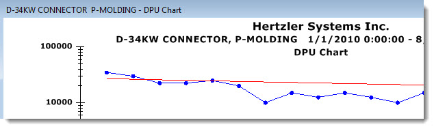
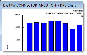
Select this check box to display bars for the data on a DPU chart or DPU Yield chart, or clear the check box to display a line chart.
This setting is ignored for DPU charts with second-level grouping.
Select this checkbox to display bars (the default setting) for the data on a DPU Cost chart. Clear the checkbox to display a line chart.
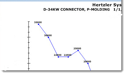
Select this checkbox to display values at data points on any DPU chart as shown in this example:
Base the plot points on:
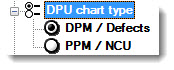
DPM / Defects. Defects per million units.
PPM / NCU. Defective units per million units.
Select this setting to display defect levels of your processes over time against an improvement (goal) line you specify with a starting date and starting value. A 10x improvement line represents a goal of reducing defects by 10 times over two years and 100 times over four years. The GainSeeker default improvement curve is 10x, a value that can be changed in the GainSeeker Administration module.
From the right-click menu on a DPU chart, you can also apply an improvement start date and start value that you have defined for any process to the current retrieval,. See Select DPU start date and value
Select this checkbox to display the Y-axis data as a percent of change on a DPU chart instead of absolute arithmetic values.
If logarithmic scale is used with a bar-type DPU chart, the bars will only display as two-dimensional:
Select the Y-axis scaling for proportional data on a DPU chart.
DPB / PPB Defects per billion units / Parts per billion
DPK / PPK Defects per thousand units / Parts per thousand units
DPM / PPM Defects per million units / Parts per million units
Percent Defects display as a percentage.
Ratio Defects display as a ratio.