The OEE Time Chart can display the OEE, Availability, Quality, or Performance of a group (such as Shift, Line, or Machine) at consecutive intervals. The x-axis of this chart is scaled based on the date range retrieved, so you can see if there are gaps in your data.
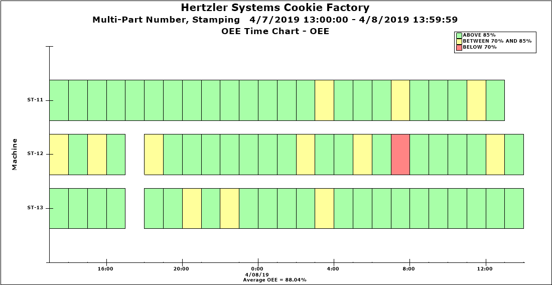
This OEE time chart displays OEE calculated hourly, for three machines:
When you create this chart, you can use the Retrieval/Configuration settings on the Settings tab to set options for Data for OEE Time chart (to choose which OEE statistic to display) and Group data for OEE Time chart by (to choose the date increments and traceability groups). It also uses Chart Override settings for OEE colors.
When this chart is displayed, you can right-click any colored cell and choose to Chart cell data or Chart row data.
You may see "gaps" in a row of data if:
no data was collected for that time period
data was collected but the Scheduled Time was zero and so OEE could not be calculated