GainSeeker OEE charts help you identify the percentage of actual productivity in a process relative to its capability by design. They are nearly identical to DPU charts in that they are grouped by a time period such as day, week, hour, minutes, or shift.
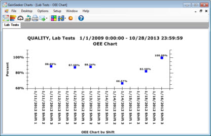
Following is an example of an OEE chart, which displays the percentage for overall OEE that is calculated from the Availability, Performance, and Quality percentages. You could also opt to display individual charts for these three submetrics along with the OEE metric chart. Then, store them as a desktop
 Note:
There are a few simple tasks to perform before GainSeeker can properly
retrieve OEE data. See OEE Retrieval
Prerequisites for details.
Note:
There are a few simple tasks to perform before GainSeeker can properly
retrieve OEE data. See OEE Retrieval
Prerequisites for details.
The y-axis labels for every OEE chart range between 0 (zero) and 100 percent. You can also set the high and low end numbers to scale the data to a range of 75% and 100%, for example.
The x-axis labels display data for the set time period such as hour, shift, or day, for example.
All GainSeeker OEE charts share these commonalities:
You can temporarily override the defaults settings for charts using the Settings tab on the New DMS Charts dialog
By GainSeeker default, OEE chart data is displayed in a line-chart format. You can change the setting to display chart data using bars. See Display bars for OEE charts
You can group data on OEE and DPU charts by one of multiple time increments, including minutes, hours, days, shift, and more.
In the following example, the data on an OEE chart is grouped by Shift.
Data
grouped by Shift displays shift
data for each day.
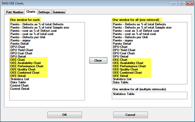
Select OEE and other DMS chart types from the Charts tab on the New DMS Charts dialog