You can change the default settings in the GainSeeker System Administration module for OEE charts. Customizing these options to meet your organization's needs can make routing analysis and charting activities faster and more convenient.
Most of these options can also be temporarily changed for a chart using the Settings tab when an OEE charts is first drawn or when it is open. Settings tab settings are temporary in that each time the GainSeeker Charts module is closed, the settings revert back to the default settings established in the GainSeeker System Administration module. See Choosing OEE charts settings for more information.
|
Contents [Hide] |
Navigate to the OEE chart defaults settings on the Configurations tab of the System Administration module by following this path:
Configurations | "Configuration Name" | chart defaults | OEE
Sets the default type of OEE calculation to display on OEE Time charts.
Set the default chart types to use for OEE retrievals using the Chart Defaults, DMS settings. Locate these settings by following this path on the Configurations tab of the System Administration module:
Configurations | "Configuration Name" | chart defaults | DMS
OEE detail columns =
Add or change the statistics for columns on an OEE detail table. See Using select statistics or select detail columns dialogs.
Statistics under OEE chart or detail =
Select statistics to display beneath an OEE chart or OEE Detail table, on your computer screen and on a printed chart. See Using the select statistics dialog. You can also opt to print a chart without the statistics. See Printing a chart without the statistics
Sets the default grouping options for OEE Time charts.
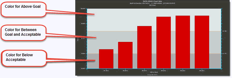
Color for Above Goal =
Change the background color for the chart zone above the line set for the goal.
Color for Below Acceptable =
Change the background color for the chart zone located below the line set for Acceptable data.
Color for Between Goal and Acceptable =
Change the background color for the chart zone for acceptable data, data that plots below the Goal zone and above the Acceptable zone.
For information about determining the goal and acceptable target zones, see Goal and Acceptable targets below in this topic.
Setting goal colors example:
Select the checkbox to display bars. Not all OEE charts support line charts.
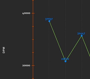
Select the checkbox to display numerical values at data points as shown in this example:
OEE Acceptable Availability value =
OEE Acceptable Performance value =
OEE Acceptable Quality value =
OEE Acceptable value =
OEE Goal Availability value =
OEE Goal Performance value =
OEE Goal Quality value =
OEE Goal value =
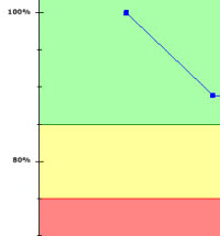
Set percentage values between 0% and 100% to display goal and acceptable limits horizontal lines on charts. These setting can help gauge improvement and tell you when any of the submetric percentages for OEE, Availability, Performance, or Quality fall below set historical values, for example. Some of the settings have GainSeeker default values set that you can change; others have no default values.
The Group data for OEE chart by dialog lets you group data by a specific time period or by a traceability item you select. Then, you can also opt to select second-level grouping for that data sets. This lets you display the results on a grouped bar plot.
Displays line options for these limits on an OEE chart:
Acceptable
Goal
These labels display on charts: A for Acceptable, and G for Goal. These labels can be changed in the Systems Administration module.
Use this setting to set the high value for the y-axis percentage range.
The y-axis on an OEE chart displays a percentage that ranges between 0% and 100%, depending on where the data plots. You can set the y-axis to always display a specific percentage value at the high and/or the low end. Setting a specific percentage range (75% and 100%, for example) can be used to normalize the chart scaling, making variance more easy to view for data that may plot in wide ranges.
Set the low value for the y-axis percentage range.
The y-axis on an OEE chart displays a percentage ranging between 0% and 100%, depending on where the data plots. You can set the y-axis to always display a specific percentage value at the high and/or the low end. Setting a specific percentage range (75% and 100%, for example) can be used to normalize the chart scaling, making variance more easy to view for data that may plot in wide ranges.
Change the default method GainSeeker uses to calculate the OEE Quality metric.
By default, GainSeeker takes lost time into account when calculating the OEE Quality metric. This can tell you how much time was lost in producing defective parts—those that do not qualify as first-pass yield. The calculation GainSeeker uses is Quality % = Time to Produce Good Parts / Time to Produce Total Parts
To change the default setting so that GainSeeker instead calculates the percentage of produced good parts relative to the total number of produced parts (the calculation GainSeeker will use is Quality = Good Parts Produced / Total Parts Produced), deselect the checkbox preceding the Take lost time into account when calculating OEE Quality.
See the OEE "Quality" metric for more information and examples on both settings.
Options:
Background color bands
Color the plot points (bars)
None
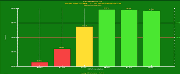
By GainSeeker default, there are horizontal zones on OEE charts for goals and acceptable limits feature colors, such as in the example below.
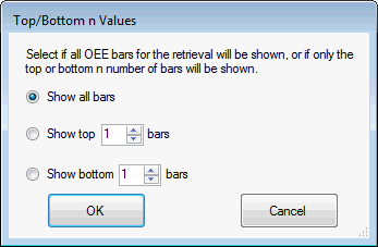
Display only the top n or bottom n values on an OEE bar chart. The default is Show all bars.
When the data is sorted by date, the bars display on the chart by the value order instead of by date.
Displaying only the top n values when you track multiple machines, for example, can help you quickly identify your machines with the least problems.
Note: When Show top n bars or show or Show bottom n bars is selected for an OEE chart with second-level grouping, the data does not properly group to reflect the second-level setting.
Double-click the setting to open the Top/Bottom n Values dialog.
Select the option button to show the top, bottom, or all bars. Then, choose the number of bars to display for your selection.