Paired Sample Analysis allows you to compare any two SPC datasets and plot them against each other, in order to find a relationship between the two.
|
Contents [Hide] |
GainSeeker creates the Paired Sample chart by retrieving two datasets and pairing the first (oldest) data record from both datasets, the second record from both datasets, etc., until one or both datasets runs out of data records to match. Each of these data pairs is then plotted on the chart. There is also an option to match data records based on a the contents of a traceability field that you specify.
Any bypassed data records are removed from the datasets before data records are matched.
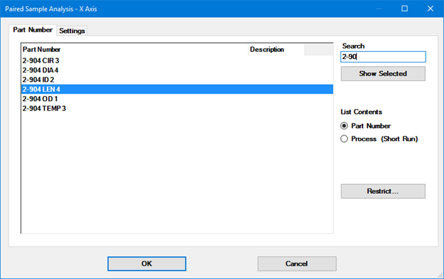
To begin creating a Paired Sample chart, you can click the Paired Sample button on the GainSeeker Charts main window, or click the File menu and then click Paired Sample Analysis. This will display the Paired Sample Analysis - X Axis window.
First, GainSeeker prompts you to define the dataset for chart's X axis by selecting the SPC standard and some basic retrieval settings - Date period, Filter, and Maximum count for retrieval. (This is similar to steps you perform when creating a new SPC chart.)
After making your selections and clicking OK, you will be prompted to define the dataset for the chart's Y axis. As before, make your selections and click OK.
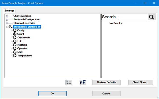
After defining the datasets for the X and Y axes, GainSeeker prompts you for any additional Settings. (This is similar to using the Settings tab when creating a new SPC chart.)
When finished, click OK to draw the chart.
There are two settings that apply exclusively to Paired Sample analysis:
On the Settings tab (shown above), these can be found at Chart overrides | Lines and Limits | Limits to display | Paired Sample .
For information on setting limits to display, see Limits to Display settings.
To group data records based on a the contents of a traceability field, select an option in this list. To turn off grouping by Traceability, set this to Count.
When Traceability grouped by is set to a traceability field, GainSeeker will group the data records for each dataset by the traceability field you specify. For the first value found in this traceability field (e.g., Serial Number 00001), GainSeeker will pair the first (oldest) data record from both datasets, the second record from both datasets, etc., until one or both datasets runs out of data records to match for that traceability value. This is repeated for all the other values found in that traceability field. Each of these data pairs is then plotted on the chart.
When Traceability grouped by is set to Count, GainSeeker will pair the first (oldest) data record from both datasets, the second record from both datasets, etc., until one or both datasets runs out of data records. Each of these data pairs is then plotted on the chart.
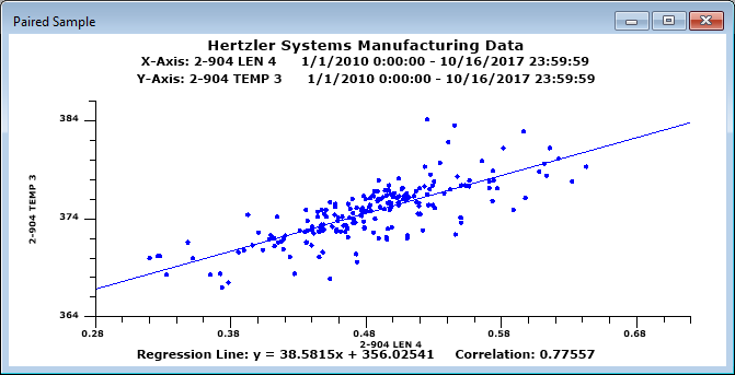
When the best-fit line is flat and the Correlation Coefficient is close to 0, this indicates that there is no correlation between the two variables.
When the line slopes downward and the Correlation Coefficient is close to -1, this indicates an inverse correlation between the two variables.
When the line slopes upward and the Correlation Coefficient is close to 1, this indicates a direct correlation between the two variables.
The sample chart above indicates a probable correlation between the two variables being analyzed.
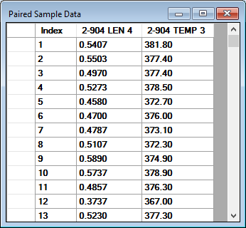
You can click on any data point to view a tooltip of the raw data for that point.
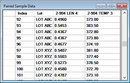
To see all of the data pairs being charted, right-click the chart and select Show Data.
When the Paired Sample chart is displayed, you can use many of the tools that are available for other chart windows, such as:
Sending the chart to the Windows clipboard, another program, an e-mail, or a file