GainSeeker allows you to specify several default options for use with the SPC Charts and Reports module. Customizing these default options to suit your needs will make routine analysis and charting activities even faster and more convenient.
Some of these settings are also applied when using the Enterprise Dashboard and Dynamic Reports modules.
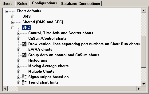
To configure default settings for SPC charts, expand the SPC tree.
|
To configure default settings for these charts, expand the Control, Time Axis and Scatter charts tree.
To choose which limits and lines to display by default on the X-bar (or X) portion of these charts, expand the Control chart limits tree. Then select the check boxes for the lines and limits you want to display by default. Your options include:
Control. Displays control limits calculated from retrieved data and the method used to calculate control limits.
Control center line. Displays the mean calculated from the retrieved data and the method used to calculate control limits.
Gate. Displays the gate limits from the standard for which data is being charted.
Gate center line. Displays the midpoint between the gate limits from the standard for which data is being charted.
Ind. Gate. Displays the Ind. Gate limits from the standard for which data is being charted.
Ind. Gate center line. Displays the midpoint between the Ind. Gate limits from the standard for which data is being charted.
Spec. Displays the specification limits from the standard for which data is being charted.
Spec center line. Displays the Nominal spec from the standard for which data is being charted.
To choose which limits and lines to display by default on the Range (or Moving Range) portion of these charts, expand the Range chart limits tree. Then select the check boxes for the lines and limits you want to display by default. Your options include:
Control center line – If checked, this will display the mean that is calculated from the retrieved data and the method used to calculate control limits.
Control lower limit – If checked, this will display the lower control limit that is calculated from the retrieved data and the method used to calculate control limits.
Control upper limit – If checked, this will display the upper control limit that is calculated from the retrieved data and the method used to calculate control limits.
Gate – If checked, this will display the gate limits from the standard for which data is being charted.
Gate center line – If checked, this will display the midpoint between the gate limits from the standard for which data is being charted.
To display sigma stripes (e.g., red, yellow and green zones) on these charts, select the Show sigma stripes check box.
By default, the sigma stripes will be colored red, yellow and green. However, you can choose different colors for sigma stripes and make these the default.
The zones displayed by the sigma stripes will be based on the value you select for Sigma stripes based on.
To display these charts without the sigma stripes, clear this check box.
To configure default settings for these charts, expand the CuSum/Control charts tree.
For more details on the calculations used for CuSum/Control charts, see CuSum statistics.
The Acceptance limit is used to calculate the upper and lower CuSum values for each data subgroup. When performing real-time CuSum checks, the upper and lower CuSum values for the data subgroup are checked against the Acceptance limit. The Acceptance limit can be based on the Upper Ind. Gate, the Upper Gate, or the Upper Spec from the standard for which data is being charted.
To select the limit from which the Acceptance limit will be calculated, expand the Acceptance limit based on tree. Then click Upper Gate, Upper Ind. Gate or Upper Spec.
To choose which limits and lines to display by default on the X-bar (or X) portion of these charts, expand the CuSum chart limits tree. Then select the check boxes for the lines and limits you want to display by default. Your options include:
Control. Displays control limits calculated from retrieved data and the method used to calculate control limits.
Control center line. Displays the mean calculated from the retrieved data and the method used to calculate control limits.
Gate. Displays the gate limits from the standard for which data is being charted.
Gate center line. Displays the midpoint between the gate limits from the standard for which data is being charted.
Ind. Gate. Displays the Ind. Gate limits from the standard for which data is being charted.
Ind. Gate center line. Displays the midpoint between the Ind. Gate limits from the standard for which data is being charted.
Spec. Displays the specification limits from the standard for which data is being charted.
Spec center line. Displays the Nominal spec from the standard for which data is being charted.
This value is used to calculate the upper and lower CuSum value for data subgroups.
To configure this value, right-click the Decision interval value node on the tree, and then enter the desired value. The Decision interval value must be greater than 0 but no greater than 10.
To choose which limits and lines to display by default on the Range (or Moving Range) portion of these charts, expand the Range chart limits tree. Then select the check boxes for the lines and limits you want to display by default. Your options include:
Control center line – If checked, this will display the mean that is calculated from the retrieved data and the method used to calculate control limits.
Control lower limit – If checked, this will display the lower control limit that is calculated from the retrieved data and the method used to calculate control limits.
Control upper limit – If checked, this will display the upper control limit that is calculated from the retrieved data and the method used to calculate control limits.
Gate – If checked, this will display the gate limits from the standard for which data is being charted.
Gate center line – If checked, this will display the midpoint between the gate limits from the standard for which data is being charted.
The C1/C2 zone is the area between C1 and C2.
To display this zone as a shaded area on the chart, select this check box.
To display sigma stripes (e.g., red, yellow and green zones) on these charts, select the Show sigma stripes check box.
By default, the sigma stripes will be colored red, yellow and green. However, you can choose different colors for sigma stripes and make these the default.
The zones displayed by the sigma stripes will be based on the value you select for Sigma stripes based on.
To display these charts without the sigma stripes, clear this check box.
This value is used to calculate the upper and lower CuSum value for a data subgroup when that subgroup is the first in the data set retrieved. It is also used in the upper or lower CuSum calculation when the previous CuSum value exceeded the Acceptance limit.
To configure this value, right-click the Start value constant node on the tree, and then enter the desired value. The minimum Start value constant is 0, and the maximum is 1.
This check box configures the default setting for whether or not to automatically create data groups.
If this check box is selected (and no other data grouping is applied to a chart or a dynamic report), then data will be automatically grouped as follows:
If data is retrieved with a filter that sorts the data in order by a traceability field, then the data will be automatically grouped and sorted by that traceability field.
Otherwise, a new data group will be created each time an Anchor point is encountered, and the data will be sorted in order by date/time stamp. (If the data does not contain any Anchor points, then all of the data will be analyzed together in a single group.)
This check box configures the default setting for whether or not to display a vertical line on charts (such as control charts) each time a new anchor point or data group is encountered.
Choose whether SPC should draw vertical lines to show every part number change on Short Run control charts. If you change parts very frequently and put many points on a chart, the vertical lines can be placed very close together and make the chart difficult to read.
To configure default settings for these charts, expand the EWMA charts tree.
For more details on the calculations used for EWMA charts, see EWMA statistics.
To choose which limits and lines to display by default on these charts, expand the EWMA chart limits tree. Then select the check boxes for the lines and limits you want to display by default. Your options include:
Control. Displays control limits calculated from retrieved data and the method used to calculate control limits.
Control center line. Displays the mean calculated from the retrieved data and the method used to calculate control limits.
Gate. Displays the gate limits from the standard for which data is being charted.
Gate center line. Displays the midpoint between the gate limits from the standard for which data is being charted.
Ind. Gate. Displays the Ind. Gate limits from the standard for which data is being charted.
Ind. Gate center line. Displays the midpoint between the Ind. Gate limits from the standard for which data is being charted.
Spec. Displays the specification limits from the standard for which data is being charted.
Spec center line. Displays the Nominal spec from the standard for which data is being charted.
This is the weighting factor for EWMA charts. A typical factor is 0.1.
To configure this value, right-click the EWMA weight node on the tree, and then enter the desired value.
To display sigma stripes (e.g., red, yellow and green zones) on these charts, select the Show sigma stripes check box.
By default, the sigma stripes will be colored red, yellow and green. However, you can choose different colors for sigma stripes and make these the default.
The zones displayed by the sigma stripes will be based on the value you select for Sigma stripes based on.
To display these charts without the sigma stripes, clear this check box.
To configure default settings for these charts, expand the Histograms tree.
To choose which limits and lines to display by default on these charts, expand the Histogram limits tree. Then select the check boxes for the lines and limits you want to display by default. Your options include:
Control. Displays control limits calculated from retrieved data and the method used to calculate control limits.
Control center line. Displays the mean calculated from the retrieved data and the method used to calculate control limits.
Gate. Displays the gate limits from the standard for which data is being charted.
Gate center line. Displays the midpoint between the gate limits from the standard for which data is being charted.
Ind. Gate. Displays the Ind. Gate limits from the standard for which data is being charted.
Ind. Gate center line. Displays the midpoint between the Ind. Gate limits from the standard for which data is being charted.
Spec. Displays the specification limits from the standard for which data is being charted.
Spec center line. Displays the Nominal spec from the standard for which data is being charted.
Select how or if you want to display outliers on histograms. You may include the outliers with the rest of the data, distinguish the outliers from the rest of the date by displaying them with a different color and pattern, or exclude the outliers from the histogram.
To configure the way that outliers should be handled on histograms, expand the Histogram outliers tree. Then click Exclude from chart, Include on chart or Mark as outliers.
To configure default settings for these charts, expand the Moving Average charts tree.
To choose which limits and lines to display by default on the X-bar (or X) portion of these charts, expand the Moving average chart limits tree. Then select the check boxes for the lines and limits you want to display by default. Your options include:
Control. Displays control limits calculated from retrieved data and the method used to calculate control limits.
Control center line. Displays the mean calculated from the retrieved data and the method used to calculate control limits.
Gate. Displays the gate limits from the standard for which data is being charted.
Gate center line. Displays the midpoint between the gate limits from the standard for which data is being charted.
Ind. Gate. Displays the Ind. Gate limits from the standard for which data is being charted.
Ind. Gate center line. Displays the midpoint between the Ind. Gate limits from the standard for which data is being charted.
Spec. Displays the specification limits from the standard for which data is being charted.
Spec center line. Displays the Nominal spec from the standard for which data is being charted.
This is the number of data points that will be averaged for Moving Average charts.
To configure this value, right-click the Moving average span node on the tree, and then enter the desired value.
To choose which limits and lines to display by default on the Moving Range portion of these charts, expand the Range chart limits tree. Then select the check boxes for the lines and limits you want to display by default. Your options include:
Control center line – If checked, this will display the mean that is calculated from the retrieved data and the method used to calculate control limits.
Control lower limit – If checked, this will display the lower control limit that is calculated from the retrieved data and the method used to calculate control limits.
Control upper limit – If checked, this will display the upper control limit that is calculated from the retrieved data and the method used to calculate control limits.
Gate – If checked, this will display the gate limits from the standard for which data is being charted.
Gate center line – If checked, this will display the midpoint between the gate limits from the standard for which data is being charted.
To display sigma stripes (e.g., red, yellow and green zones) on these charts, select the Show sigma stripes check box.
By default, the sigma stripes will be colored red, yellow and green. However, you can choose different colors for sigma stripes and make these the default.
The zones displayed by the sigma stripes will be based on the value you select for Sigma stripes based on.
To display these charts without the sigma stripes, clear this check box.
To configure default settings for Multiple Charts, Process Capability Charts and Multiple Data Tables, expand the Multiple Charts tree.
To set the default chart type for Multiple Charts, expand the Multiple chart type tree and then click Histograms, Range charts, X-bar and range charts or X-bar charts.
To configure default options for Multiple Capability / Box & Whisker charts, expand the Process capability chart options tree.
To configure the way that data distributions are displayed on the chart by default, expand the Graph type tree and then click Box, Box and whisker, Centered box or Histogram.
To display a representation of the individual data values on your chart by default, select the Show data on graph check box.
To choose the default statistic to be displayed for each data distribution, right-click the Value to display on graph node on this tree and then choose a statistic.
When this check box is selected, the user is prompted to select which columns to display and how data should be grouped before a Multiple Data Table or Combined Control Chart is drawn.
For more information, see Defining the "Shared Traceability" columns, Matching and sorting data records in a Combined Control Chart or Retrieval group columns in a Multiple Data Table.
If you select the Show sigma stripes check box for Control, EWMA, Moving Average, or CuSum charts, then GainSeeker will display that chart with green, yellow, and red zones.
The green zone represents the chart area that is within 2 sigma of the chart's midline. (On Range charts, the low side of the green zone will automatically extend to the zero point.) The yellow zone represents the area between 2 sigma and 3 sigma from the midline. And the red zone represents the area beyond 3 sigma from the midline.
You can choose to base the midline for Sigma stripes on Control, Spec, or Gate limits. To do so, expand the Sigma stripes based on tree and then choose Control, Gate or Spec.
If based on Control limits, the midline is the mean for this data set.
If based on Spec limits, the midline is the midpoint between the upper and lower specification limits in the standard. If the standard contains only one specification limit, the midline is the Target X (Nominal) value in the standard. If the standard contains only one specification limit and no Target X (Nominal) value, sigma stripes will not be displayed for this standard.
If based on Gate limits, the midline is the midpoint between the upper and lower Gate limits in the standard. If the standard contains only one Gate limit, sigma stripes will not be displayed for this standard.
This setting does not affect calculated statistics or real-time checks.
To choose which limits and lines to display by default on Trend charts, expand the Trend chart limits tree. Then select the check boxes for the lines and limits you want to display by default. Your options include:
Control – If checked, this will display the control limits that have been calculated from the data shown on the chart.
Control center line – If checked, this will display the mean (the midpoint between the upper and lower control limits) that is calculated from the data shown on the chart.
Gate – If checked, this will display the gate limits from the standard for which data is being charted.
Gate center line – If checked, this will display the midpoint between the gate limits from the standard for which data is being charted.
Ind. Gate – If checked, this will display the Ind. Gate limits from the standard for which data is being charted.
Ind. Gate center line – If checked, this will display the midpoint between the Ind. Gate limits from the standard for which data is being charted.
Spec – If checked, this will display the specification limits from the standard for which data is being charted.
Spec center line – If checked, this will display the midpoint between the specification limits from the standard for which data is being charted.